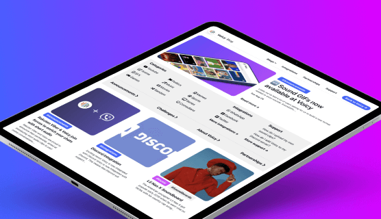
In the past few weeks we’ve been working on an exciting redesign of the Voicy blog. The blog is a centralised spot for Voicy to write about central topics surrounding content, integrations, community, and announcements. With the intention to make the blog a more organic centre of all these pieces of extensive stories, a clean and engaging design has been developed and implemented.
The redesign is a great example of how we would like to bring engaging content such as blogs, stories, updates, and news to our users.
Short sound categories
Within the blog it is now possible to explore several sound content categories, such as the categories Politics, Memes, and Movies. Blogs on soundboards, specific sounds, sound topics, and memes are displayed within the categories itself. Some features have been implemented to make it easier to discover new soundboards and sound clips from within the blogs.
Integrations
We’ve also implemented an environment for displaying all integrations we have and how users can make use of them. There are a lot of ways users can use short sounds within their favourite apps, but it’s not always as obvious. Per app/integration, there will be a page explaining what kind of integration is present and how to use it.
NEW: Challenges
With the new segment ‘challenges’, we’re challenging the community to come up with new sounds and soundboard for certain themes. Users can win prices and/or points for creating awesome sounds or soundboards. More information coming soon!


